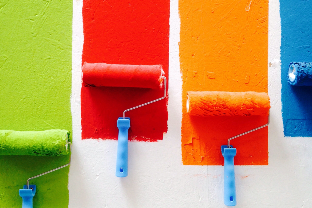
There are so many psychology tips related to colour and how it can affect how people feel and respond. In the 3rd of our tips and tricks blog posts, we'll focus on just 1 aspect, colour saturation:
- Saturated colours (deep reds and oranges etc) are associated with being closer.
- Less saturated colours (such as greyscales) are associated with being further away.
Some great research has been done in this area with some interesting outcomes for e-commerce stores! As with all CRO (conversion rate optimisation) focused changes, it's important to A/B test them to make sure you're getting the results you expect.
Tip 1: Deadlines in promotions? Use saturated colours
Objects closer to you get more of your attention. As saturated colours also grab your attention you associate them with being closer (strange right?!).
This effect has also been shown to happen with time as well, so when you run a promotion with a deadline choose a saturated colour.
In a study where people viewed an ad for a fundraiser if the event was occurring in the distant future, they donated more money when the imagery was in black-and-white (Lee, Fujita, Deng, & Unnava, 2017).
Tip 2: Selling luxury products? Use greyscales
Lots of luxury brands already use this effect to their advantage. Luxury brands are aspirational so we want them because they feel distant - as if we can’t own them.
Reduce the saturation of colours in your designs and the desaturated colours will strengthen the luxury perception of your brand.
Studies have found that ads for luxury brands perform better with greater distance between the product and the model (Chu, Chang, & Lee, 2021) and people also prefer luxury brands when they are standing farther away from them (Chu, Chang, & Lee, 2021).
Bonus Tip: Use this to your advantage in promotional images. Increase the distance between people and the product to achieve a similar effect.
Tip 3: Showing product details? Use saturated colours
Because saturated colours feel closer to you this closeness orients your focus toward the details of these objects. Therefore use saturated colours when describing the details of a product.
In a study customers preferred red advertisements that described the details of a camera, but they preferred blue advertisements that described an overview (Mehta & Zhu, 2009).
Bonus Tip: If you have a lot of text you should reduce the saturation so your design feels further away, and therefore less overwhelming!